Hey guys
The last time i posted something was way back, before the terror in Gaza, before Ramadaan, even before the final of World Cup 2014. For some reason I did not have the ampedness of writing a blog, although this is something I enjoy. Maybe it's just that Friday is always before Saturday and you always want to do nothing.
During the last months I've done quite a lot of projects from work: more kitchen designs, cadding a pavilion extension, fixing up a renovation building for people going post rehabilitation and designing an attic room. It's all fun but tedious work, but hey, it's still fun.
I'm not going to post pictures of my work and instead I will do another Random House Review!
This time I will do a house in Asia because Asia is cool.
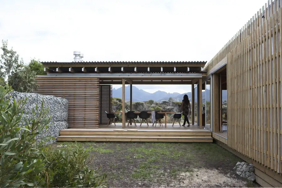
House K
+Tokyo, Yuji Kimura Design
photo courtesy of Dezeen Magazine
The house is set on a suburb and yet very busy road, since it located to the main road. With that in mind, the client wanted privacy for his house but still be able to take in as much ventilation and light as possible. What the architect did was he designed high walls for security and small windows for privacy.
What he did as well was he maximized the number of one window for each room designation, thus creating a complete ventilation circulation and as well as natural lighting for each rooms.
The client wanted to include a balcony but unsure about it as it might compromise security. The architect, as badass as he was, enclosed the revealing balcony with vertical timber slats attached to translucent panels that blurs out vision from the outside, yet providing light as well. He touched up the balcony by adding a head high windowless opening.
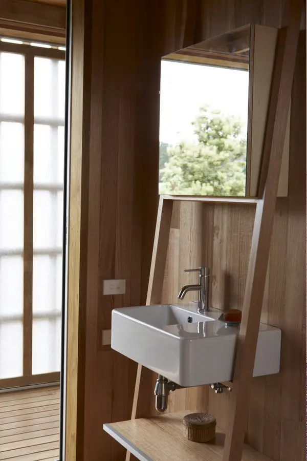
photo courtesy of Dezeen Magazine
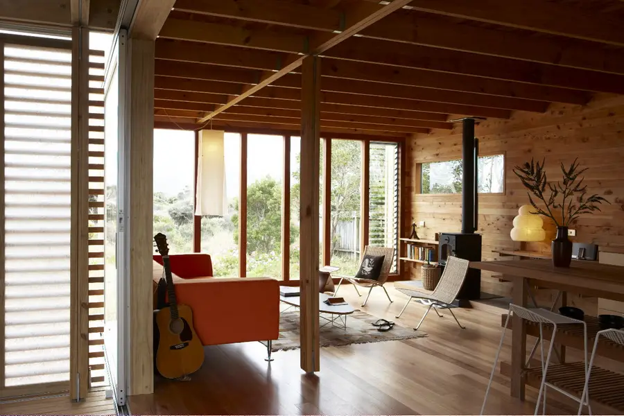
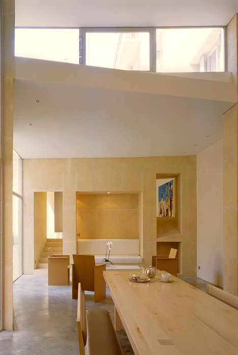
Not only did he create harmony and usability by connecting timber, plastic and steel for the outdoors, he also implied a minimalism design for the interior. The white painted walls and built in cupboards with the longitudinal timber flooring simplifies a modern house.
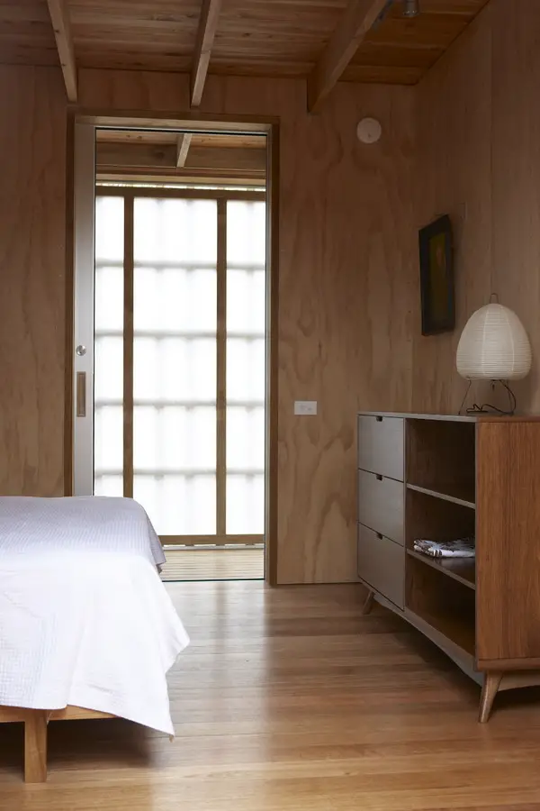
photo courtesy of Dezeen Magazine
Surely just by looking at these pictures made you feel relaxed and made you feel wanting to go to Japan and explore all the cultures of how to make the perfect cup of herbal green tea.
Well that's it for now
Cheerio

-page-001.jpg)
-page-001.jpg)